The Steel Grate Co
BRANDING
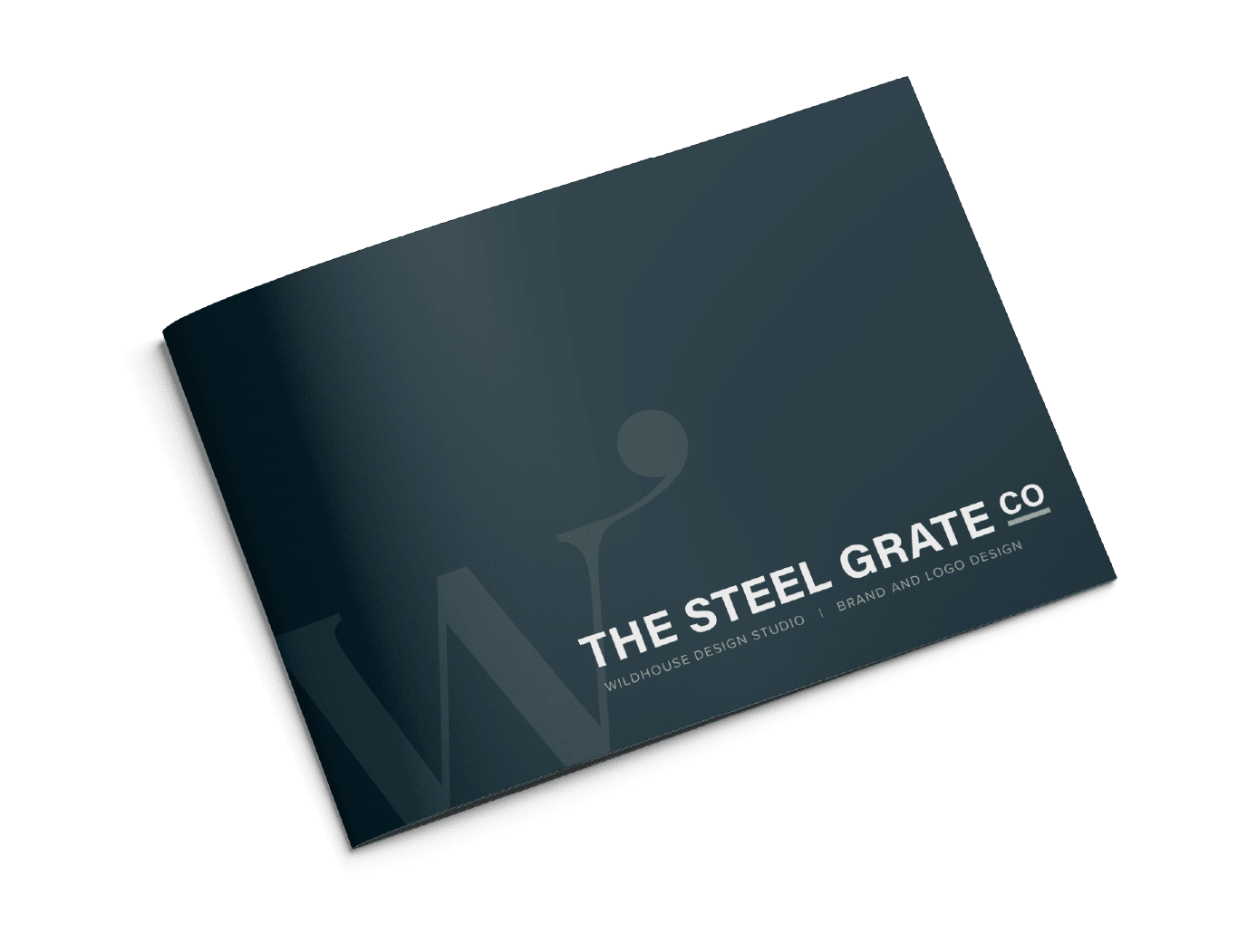
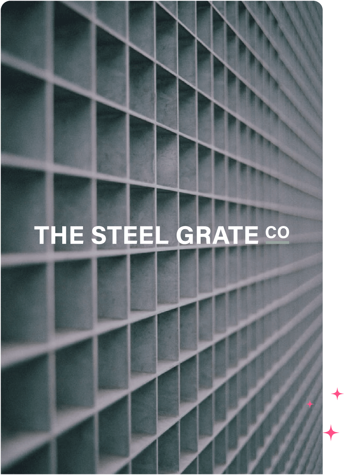
The Steel Grate Co, one of our Wild Brands, was developed as a brand that would effectively communicate their strength and reliability in the steel industry. Our goal was to create a modern and professional look that sets them apart from competitors and resonates with their target audience. The branding needed to be robust yet approachable, reflecting their commitment to quality and precision.
Design & developments
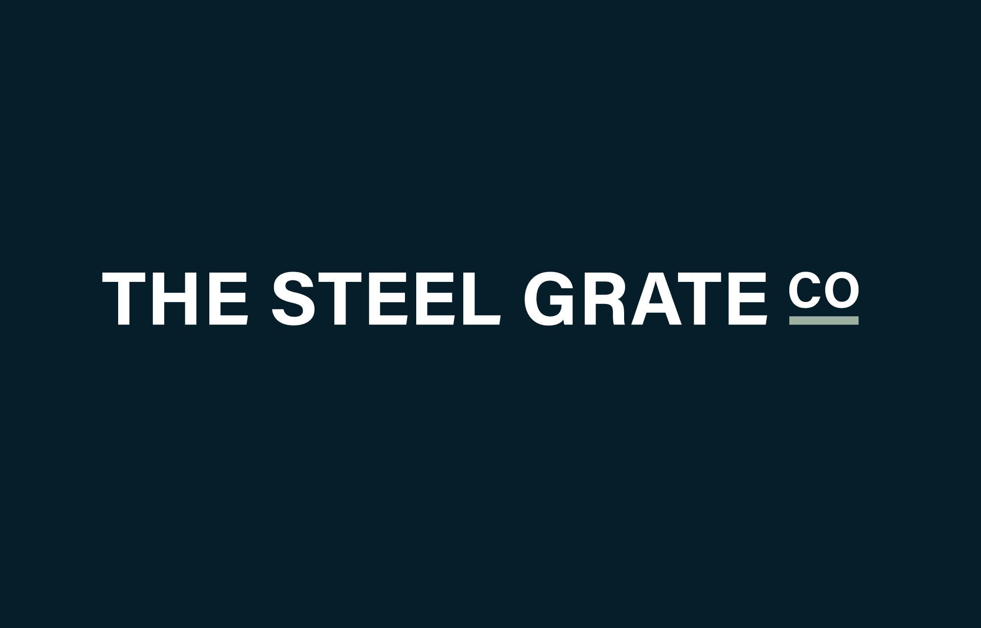
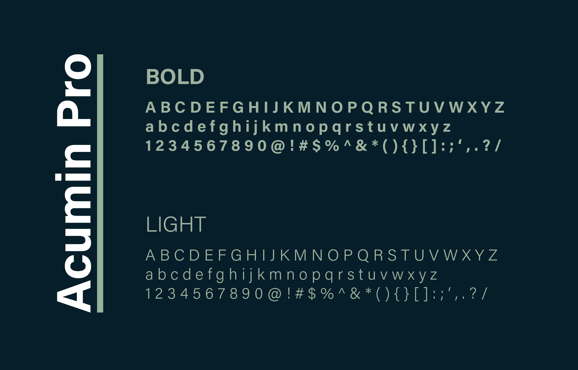
We began the branding project by designing a typographic logo that embodies the core values of The Steel Grate Co. The clean and modern lines of the logo, created using the Acumin Pro font, convey a sense of precision and professionalism. Our design process focused on creating a cohesive and impactful visual identity that aligns with the company’s mission and values.
Colours
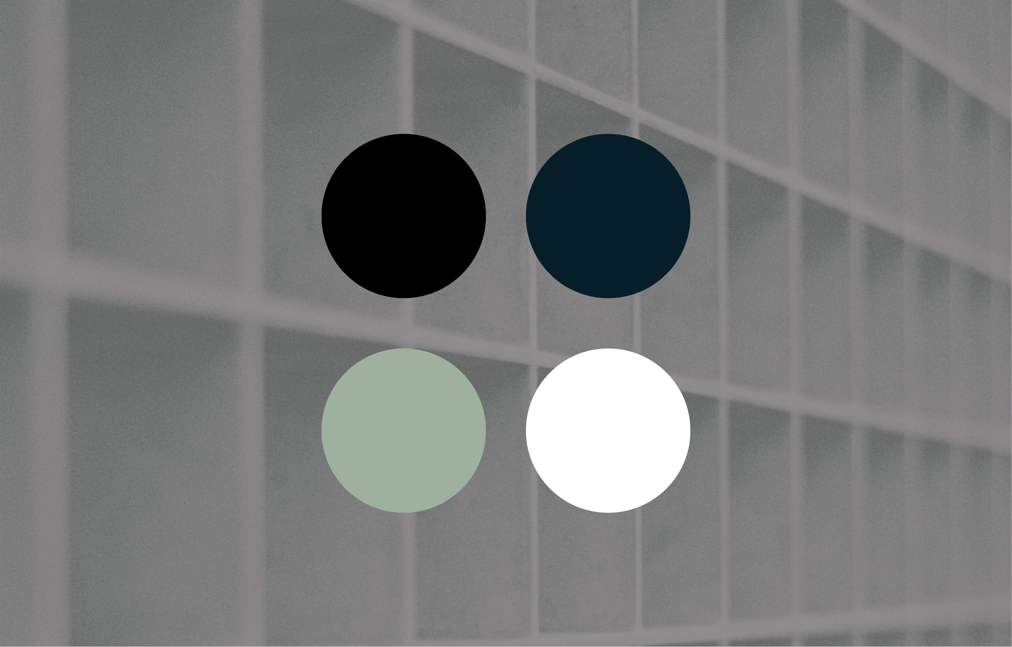
The chosen colour palette of onyx, denim, white, and sage was selected to represent strength, reliability, and modernity. Onyx provides a solid and authoritative base, while denim adds a touch of industrial robustness. White introduces a clean and professional look, and sage adds a hint of freshness and approachability. Together, these colours create a balanced and versatile palette that enhances the brand’s visual appeal.
Typography
We selected Acumin Pro for its clean and versatile aesthetic. This font is both modern and highly readable, making it perfect for a company that values precision and clarity. The typographic logo designed with Acumin Pro exudes confidence and professionalism, reinforcing The Steel Grate Co’s brand identity across all platforms.
Brand guidelines
To ensure consistent application of The Steel Grate Co’s new brand identity, we developed comprehensive brand guidelines. These guidelines include detailed instructions on the correct use of the logo, colour palette, typography, and other visual elements. By adhering to these guidelines, The Steel Grate Co can maintain a cohesive and professional brand presence across all communications and marketing materials.
